In the world of web design, the art of combining color theory with typography is essential for creating engaging and effective user experiences. These elements are more than just visual aesthetics; they play a critical role in conveying messages and guiding user interactions.
Understanding Color Theory
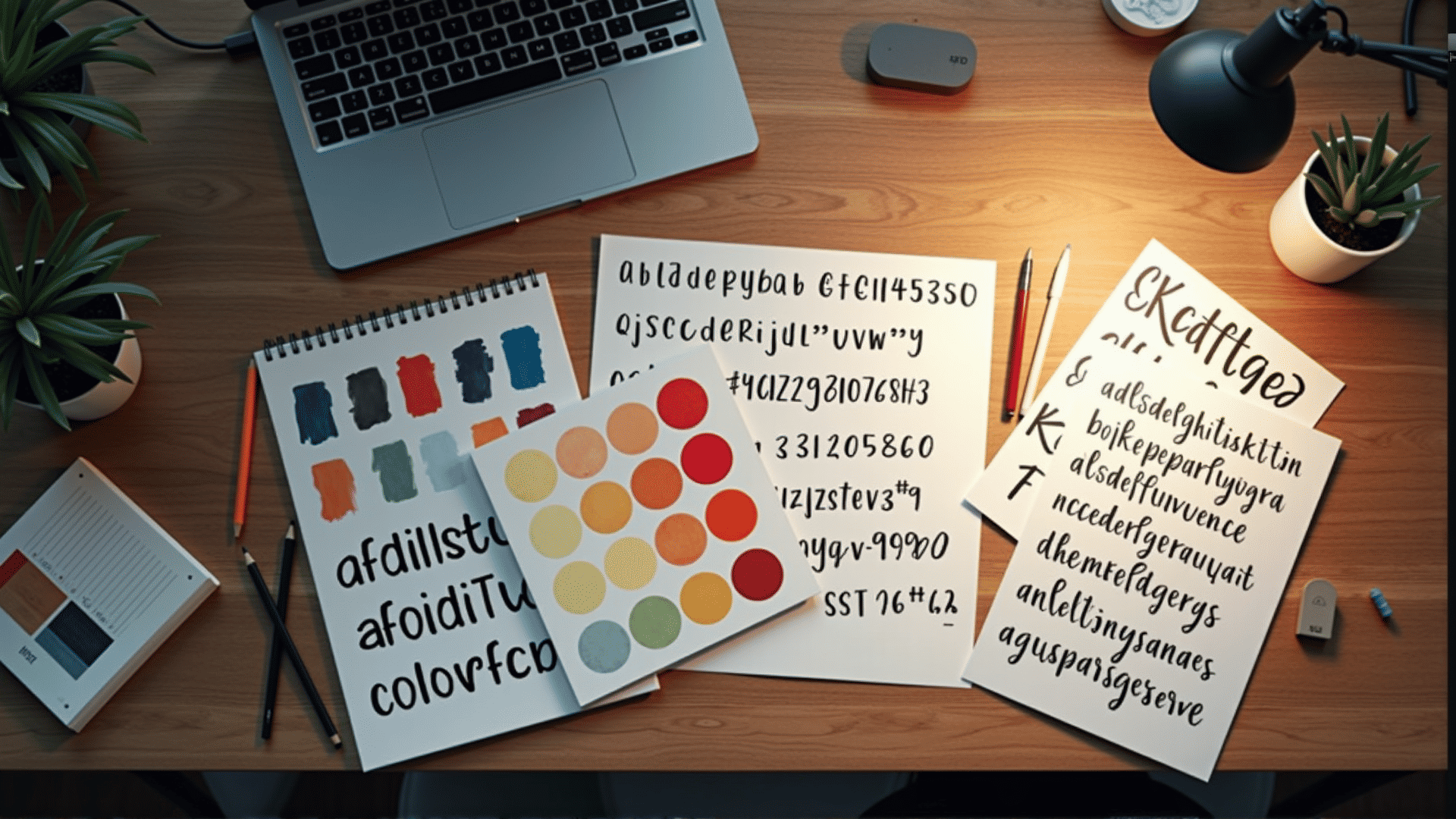
Color theory is a foundational aspect of design that impacts how users perceive and interact with a website. At its core, it involves the strategic use of colors to evoke emotions, establish visual hierarchy, and enhance readability.
-
Emotional Response: Different colors can elicit various emotions. For instance, warm colors like reds and oranges can create a sense of urgency or excitement, while cool colors like blues and greens can evoke calm and trust. Understanding the emotional connotations of colors helps in aligning with the intended message of the website.
-
Visual Hierarchy: Color contrast is vital for creating a clear visual hierarchy. By using contrasting colors, designers can guide the user's eye to key elements, such as call-to-action buttons or important content sections, ensuring that information is easily digestible.
-
Brand Identity: Consistent use of color builds a recognizable brand identity and ensures that the website aligns with the company's overall palette. This consistency helps in creating a cohesive user experience across different platforms and materials.
The Role of Typography
Typography is the art of arranging type to make written language legible, readable, and visually appealing. In web design, typography is a powerful tool for communication and can significantly influence how content is perceived.
-
Readability and Clarity: Choosing the right typeface and size is crucial for ensuring text is easy to read. Sans-serif fonts are often preferred for digital displays due to their clarity at various resolutions, while serif fonts can bring a touch of elegance and are often used for print or high-resolution displays.
-
Tone and Personality: Typography has the capacity to convey personality and establish the tone of the content. A playful script can create a sense of whimsy, while a clean and modern typeface may suggest professionalism and clarity.
-
Hierarchy and Structure: Just like color, typography helps establish content hierarchy. Utilizing various font weights, sizes, and styles can distinguish headings from body text, guiding the reader through the content smoothly.
Synergy in Web Design
When color theory and typography are combined thoughtfully, they create a cohesive visual language that enhances user engagement. Designers must consider how these elements interact:
-
Contrast and Legibility: Ensuring sufficient contrast between text and background is crucial for legibility. This involves selecting colors that enhance the readability of the text while maintaining visual harmony.
-
Consistency across Elements: Consistent use of color and typography across different web elements helps build a unified experience. This consistency aids in user navigation and strengthens the overall design.
-
Responsive Design: In an era where users access websites on various devices, it's essential that typography and color choices remain effective and appealing on screens of all sizes.
In conclusion, the thoughtful application of color theory and typography is indispensable in web design. These elements not only define the visual appeal of a website but also support the delivery of clear and effective messages to users. By understanding and utilizing these principles, designers can create websites that are both aesthetically pleasing and highly functional.