Understanding the intricacies of color and typography is essential for creating web content that is not only visually appealing but also effective in communicating its message. Both elements play a significant role in shaping the user experience by setting the tone, guiding the reader’s eye, and enhancing the readability of the content.
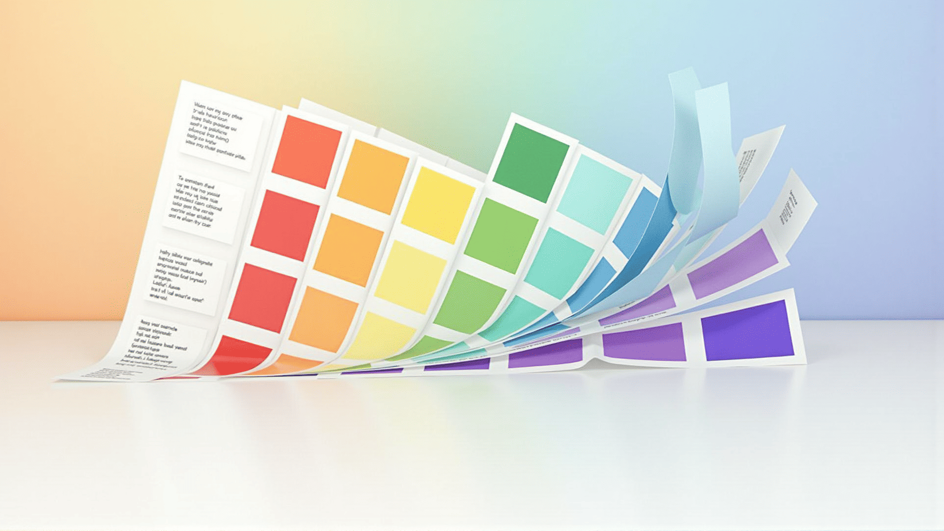
At a fundamental level, color can evoke emotions and influence perceptions. Different hues can trigger varied psychological responses, which is why choosing the right color palette is crucial when designing web content. For instance, blue is often associated with calmness and trustworthiness, while red can evoke a sense of urgency or passion. By selecting colors that align with the message you wish to convey, you can enhance the overall impact of your content.
Moreover, color can direct attention and create a visual hierarchy on a page. Strategic use of contrasting colors ensures that important elements, such as calls to action or headlines, stand out. This not only grabs the reader’s attention but also guides them through the content in a logical and engaging manner. Harmony among colors is equally important, as clashing tones can detract from the message and lead to a disorganized appearance.
In addition to color, typography is a powerful tool in setting the tone of your web content. The choice of fonts can convey different moods and levels of formality. For example, serif fonts are often perceived as traditional and authoritative, while sans-serif fonts are considered modern and clean. Selecting a font that resonates with the intended message and audience enhances the content’s overall effectiveness.
Readability is another critical aspect of typography. Factors such as font size, line spacing, and letter spacing can significantly affect how easily text can be read on a screen. Optimal readability ensures that users can consume the content without straining their eyes, creating a more pleasant and accessible experience. Additionally, maintaining consistency in typography helps establish a cohesive look across the entire web page.
Combining well-thought-out color schemes and typography choices can greatly enhance the user interface and make the content more inviting and engaging. This synergistic approach not only beautifies the web page but also ensures that the message is conveyed in a clear, impactful manner. By understanding and implementing effective color and typography strategies, content creators can elevate their designs and provide a seamless user experience.