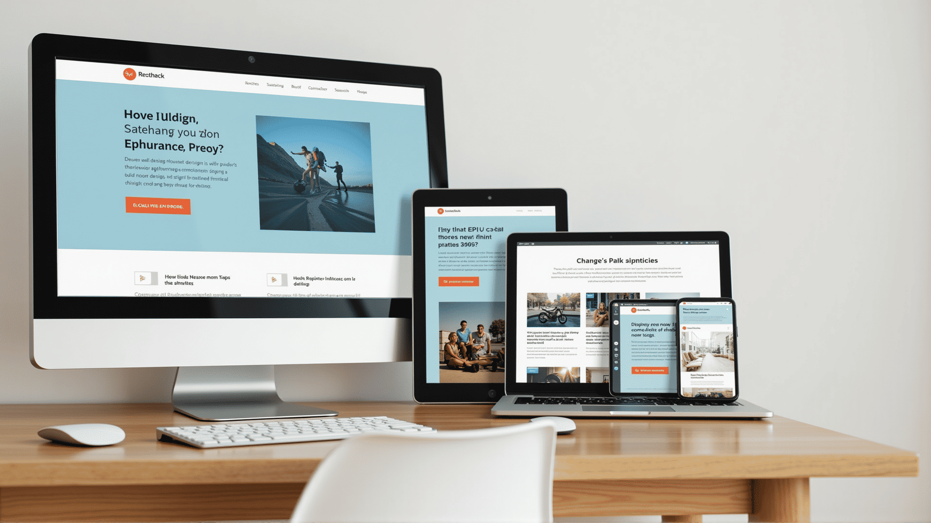
In today's digital age, creating web experiences that look stunning on all devices is essential. Responsive design techniques are pivotal in ensuring that a website is user-friendly regardless of the screen size or type of device used to access it. Let's explore key components of responsive web design that make this possible.
Flexible Grid Layouts
One of the foundational principles of responsive design is the use of flexible grid layouts. These grids employ relative units like percentages instead of fixed units like pixels to define the layout of a webpage. This adaptability allows for content to adjust dynamically, filling up the space available on a user's screen without causing horizontal scrolling.
Fluid Images
Just like the flexible grid, images should also be fluid. By setting images to a percentage of their container size, they become responsive. This approach ensures that images resize proportionally, maintaining their quality without stretching or pixelating as the viewport size changes.
Media Queries
Media queries are a cornerstone of responsive design, enabling developers to apply different styles based on the characteristics of the device being used. Using CSS, media queries allow you to target styles for specific screen widths, orientations, or resolutions. Whether a user is on a smartphone in portrait mode or a desktop with a wide screen, media queries help fine-tune the visual presentation.
Mobile-First Approach
A mobile-first approach consists of designing the smallest, least powerful version of a product or page first, then scaling up with more features for larger screens. This method not only ensures a consistent experience across devices but also prioritizes essential content. Developing for mobile first ensures that core features and content are efficiently implemented, optimizing the experience for users on smaller devices.
Responsive Typography
Text is a significant part of any web experience. Responsive typography adjusts the size and weight of fonts based on screen size. By using relative units like ems or rems, you can ensure that text maintains readability on every device. Combining this with media queries, you can further adjust font sizes and line heights at specific breakpoints, enhancing readability.
Testing Across Devices
Ensuring that a responsive design works across a multitude of devices and browsers requires comprehensive testing. Simulators and various browser developer tools can initially check how a design responds. However, testing on real devices is crucial for an accurate representation, catering to diverse user experiences and devices' peculiarities.
Adaptive Elements
Responsive design sometimes calls for elements to adapt or change not only in size but also in complexity. For instance, navigation menus may switch from a horizontal bar on large screens to a collapsible hamburger menu on small ones. Adaptive elements ensure a coherent and user-friendly interface.
By integrating these responsive design techniques, web developers can create websites that provide seamless user experiences regardless of the device being used. The main goal is to accommodate diverse user needs and preferences, ultimately leading to enhanced satisfaction and engagement with digital content.